Ideal Green Grove.
A cannabis retail brand with no content system, taken from a standing start to over 1,000 engaged followers through an education-first campaign structure built to survive platform restrictions.
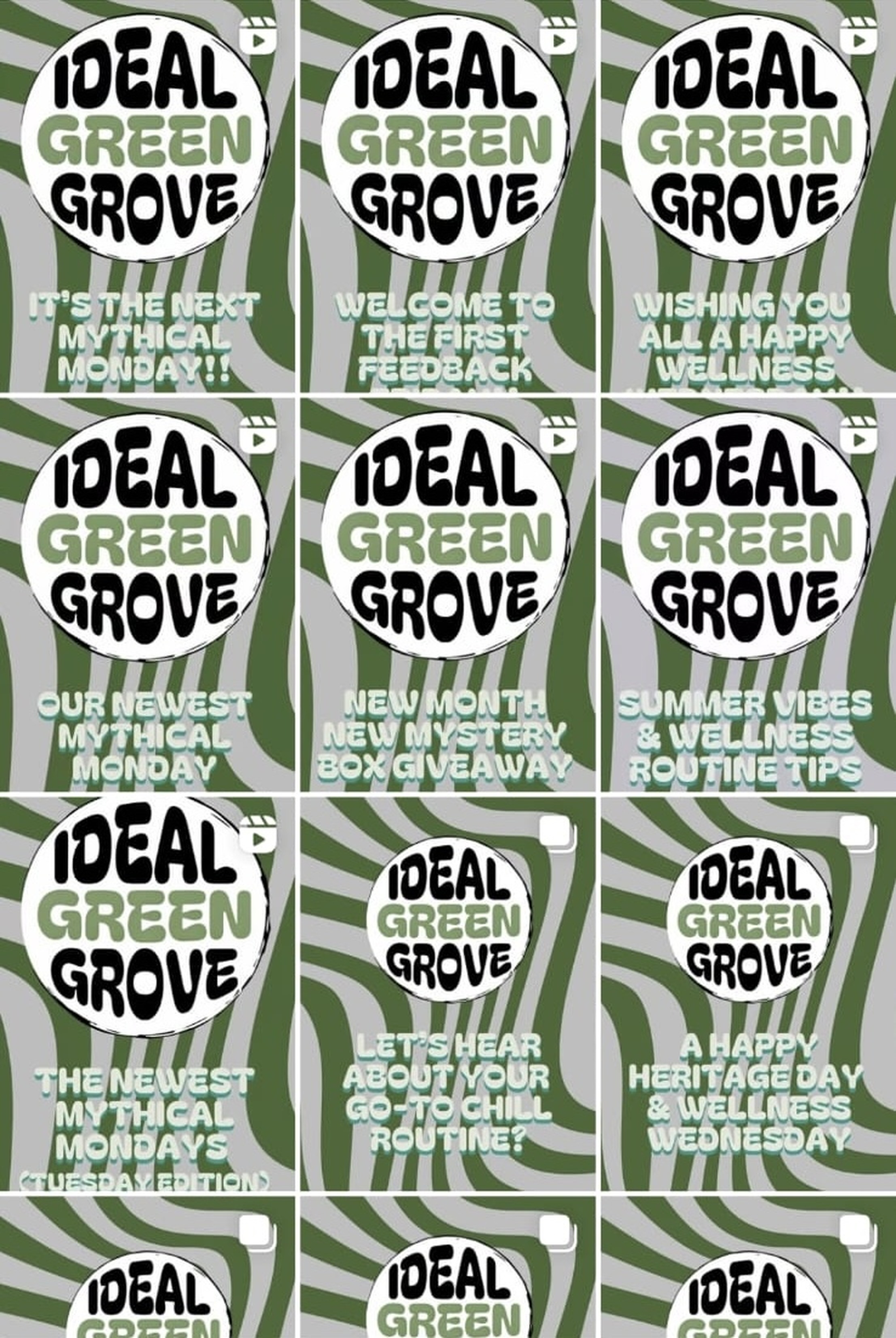
Ideal Green Grove is a South African cannabis wholesaler and retailer. Three founders, strong product, and no social presence to speak of. Their goals were plain enough — conversions and brand awareness, aimed at adults 22 and up across Gauteng, Durban and the Eastern Cape — but the tone was harder to place. Friendly, professional, educational. Never memes. Never a hard pitch.
The complicating factor was the category itself. In cannabis retail, the platform doesn't tell you it's throttling your reach; it just quietly stops showing your posts to anyone who doesn't already follow you. Selling openly is a fast route to invisibility. The brief, unspoken but obvious, was to build trust and drive conversions without ever looking like we were selling anything.
The clearest example of how this constraint changed the work is a caption I rewrote three times in the first week. It's worth showing in full because everything after it inherits the same rule.
Product-led, benefit-driven — the standard retail move. Named the product, sold the effect, closed with a call to buy.
Client response — They didn't want it to sound like selling. Not for tone, but for survival: a post like that gets flagged and never reaches the explore page.
Still product-named up top, but restructured around the experience rather than the pitch.
Client response — Better. Still selling.
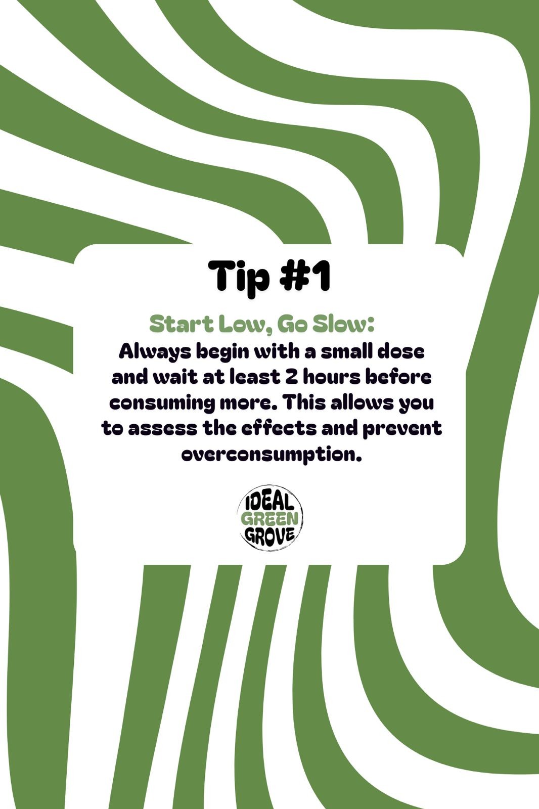
Educational framing. How to approach edibles, why starting small matters, why setting matters more than most people think. The product appears as context, never as pitch.
Every caption that followed was written to this rule. Education first, product second, sales never.
With the tone settled, the next problem was rhythm. Ad-hoc posting isn't a strategy; it's just noise the algorithm has no reason to reward. What the brand needed was a shape the audience could learn to expect. The three-day weekly structure arrived, unglamorously, at two in the morning, got signed off the same day, and ran for six months.
Mythical Monday corrected the misinformation that follows cannabis around — dosages, effects, legal status, the wilder claims made on both sides of the argument. It positioned the brand as the informed voice in the category rather than another retailer shouting about specials.
Wellness Wednesday connected the product to routine, recovery and mindfulness. Practical, quiet, useful. Screenshot-worthy in the sense that a follower would actually save it to send to a friend.
Factual Friday, later Flower Friday, went into cultivation, quality and sourcing. How to tell good flower from hype. Why terpene profiles matter. What growers actually do. Content the audience couldn't get anywhere else in the local market, presented without condescension.
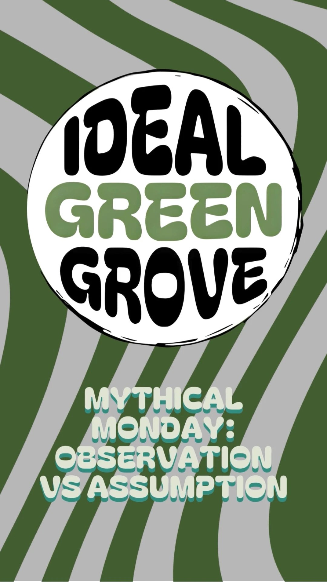
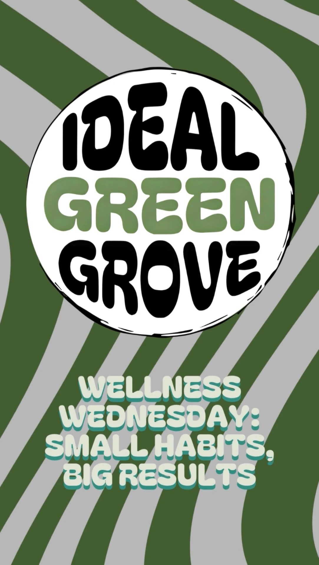
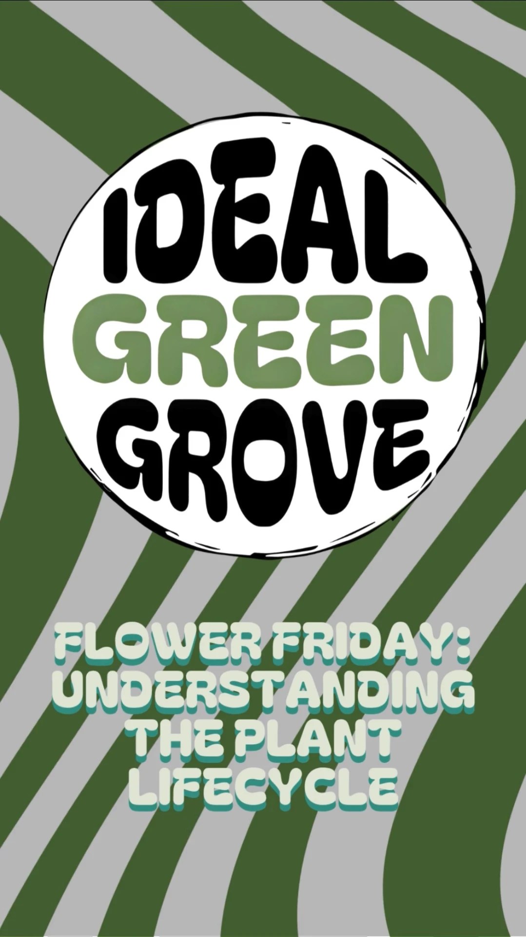
The brand identity carried a green wave motif — a flow line that ran through the logo mark. I pulled that motif into every content template so the grid read as one continuous surface rather than a stack of individual posts. Look at nine tiles at once and the eye follows the line from post to post before it reads a single word.
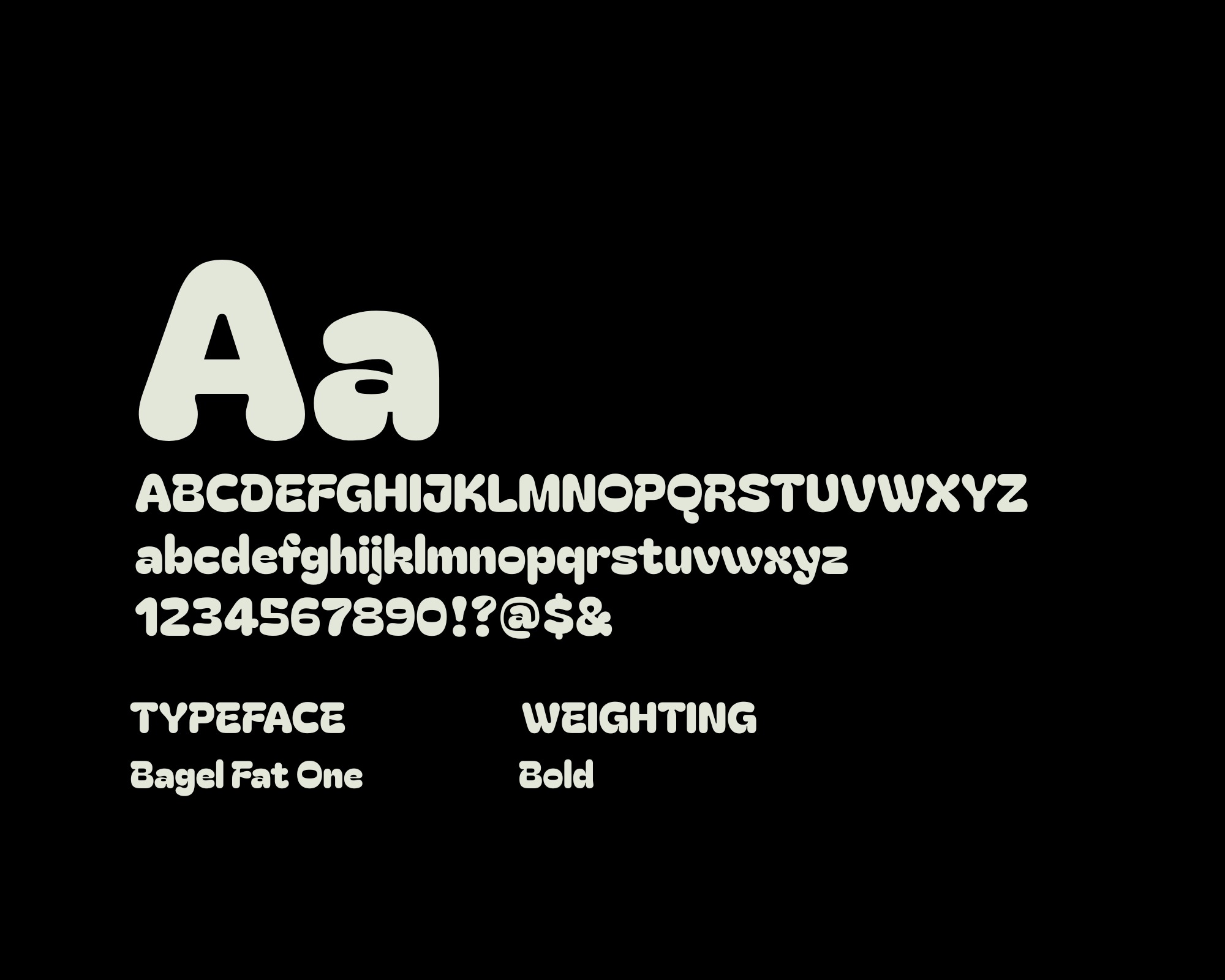
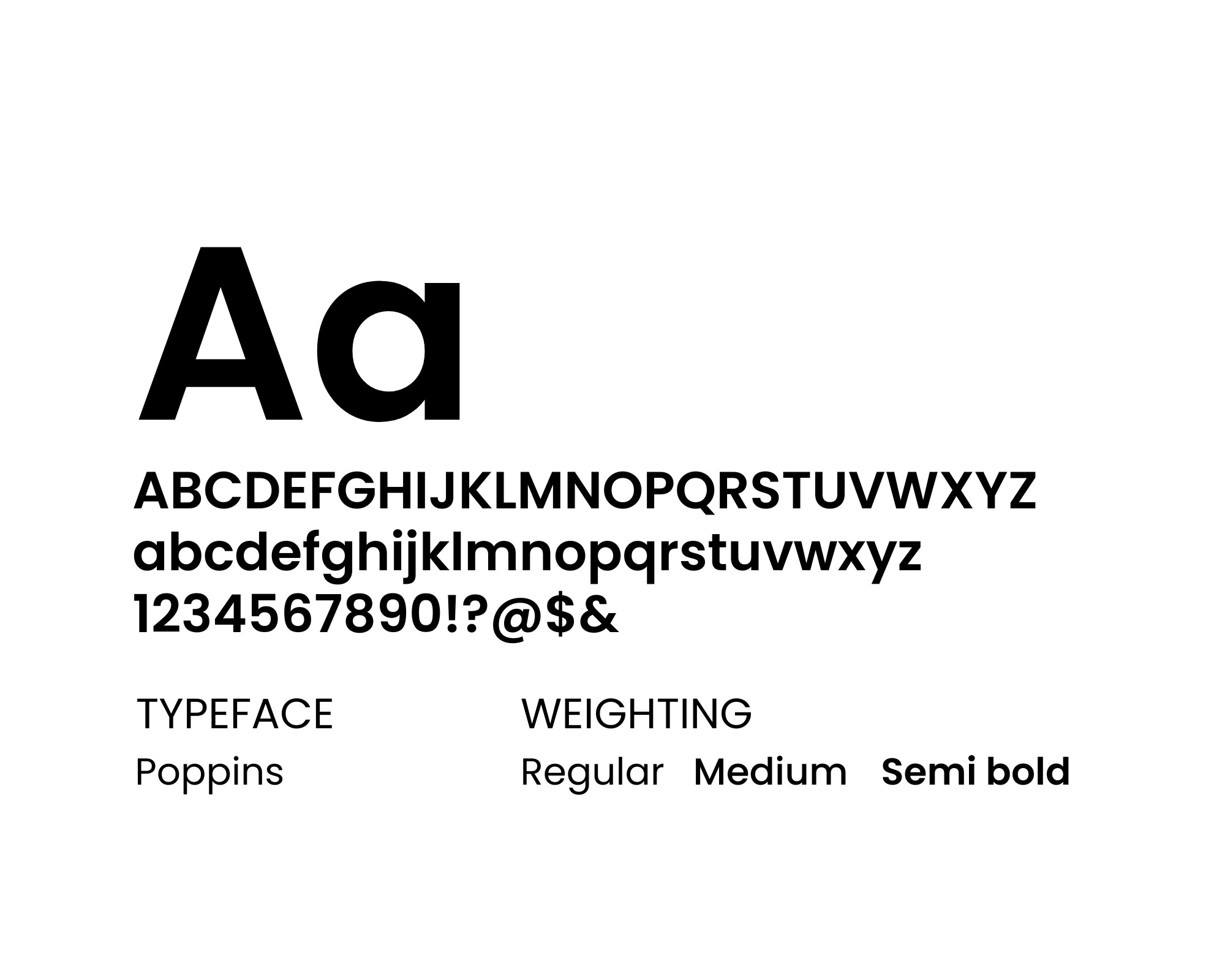
Typography changed early. The first pass was lighter, more contemporary; the client pointed out that their core audience skewed older and wanted something more legible from a phone across a room. We moved to a heavier face and the read rate improved immediately. It's the kind of note that sounds trivial in retrospect and would have been an obvious mistake to argue with at the time.
The recurring problem was black. Black elements — icons, dividers, the occasional block of type — kept reading as harsh against the soft flow lines. It took several passes to find a treatment that stayed legible while keeping the black subtle enough not to fight the palette. A few attempts were rejected by both sides before we landed on the version that shipped. Worth documenting because most case studies pretend the final answer arrived first.
Every post was designed to Instagram carousel dimensions from day one, then rebuilt to reel dimensions later in the year when the format shifted. The templates were built to make that rebuild an afternoon of work rather than a redesign.
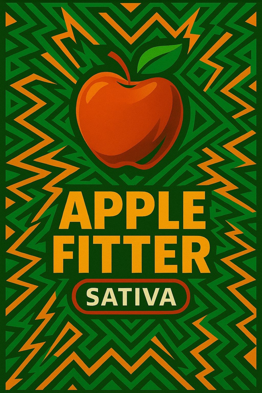
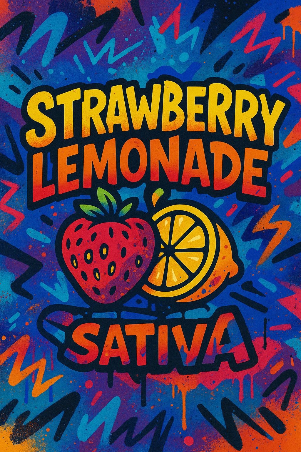
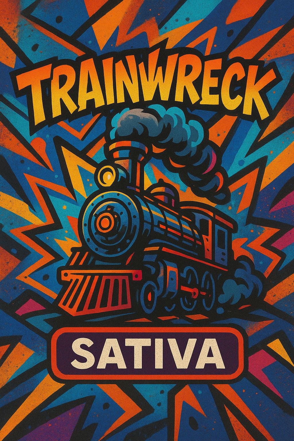
Alongside the social work, a small parallel brief: packaging concepts for five strains — Apple Fitter, Sour Diesel, Strawberry Lemonade, Trainwreck and Super Silver Haze. Bold illustrated style, one visual system, five distinct personalities. Iterated in-thread with the founders, revised in the same session, shipped without ceremony.


Five mystery-box campaigns across the run, escalating in scale and prize value. The first followed the standard entry structure: like, follow, share, comment. Within a day the client flagged the obvious problem I'd missed — unlimited tagging meant one enthusiastic person could rack up a hundred entries and the winner pool stopped meaning anything. We simplified to one entry per person, one bonus entry for a story share, and the quality of engagement went up immediately.
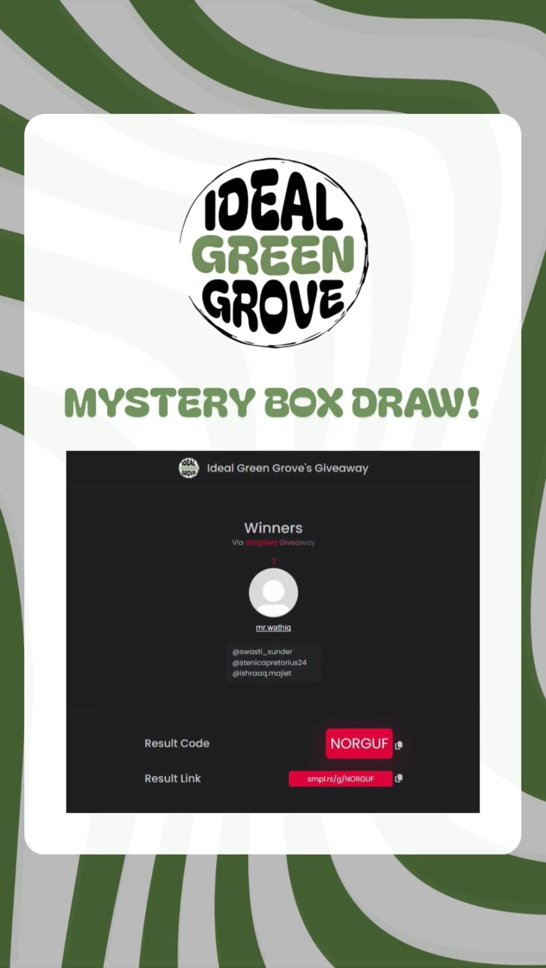
The next scale problem was mine to solve. One giveaway pulled 535 comments, which turned manual winner selection from a chore into a bottleneck the campaign couldn't afford. I researched and implemented a third-party comment picker that verified follows and likes and capped entries at 5,000. What had threatened to become a manual audit became a repeatable process — the same tool ran every subsequent campaign without incident.
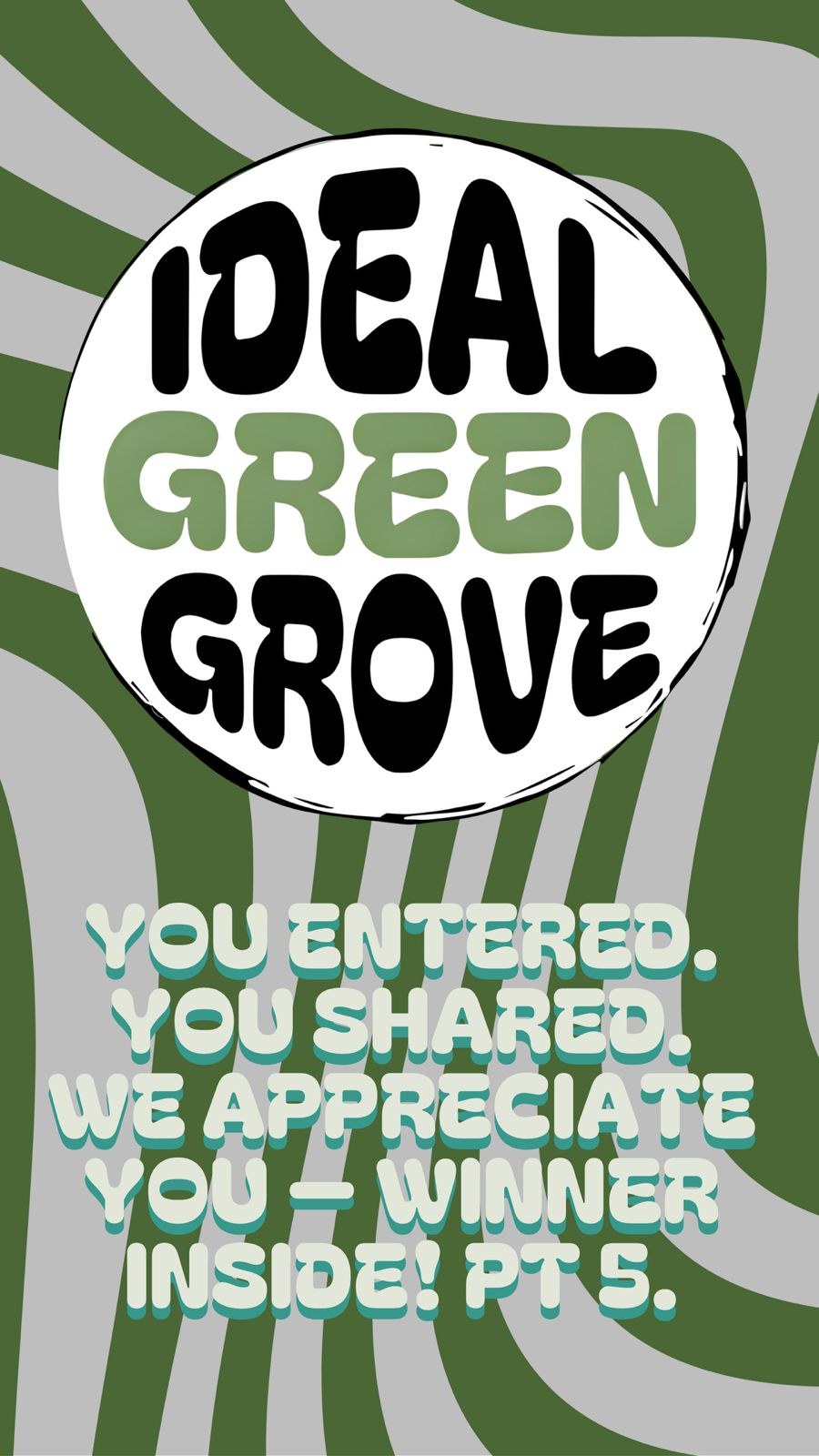
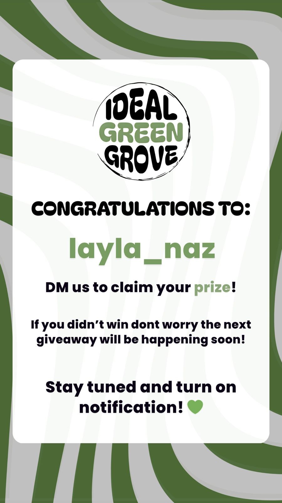
Prizes escalated from a standard mystery box in the early campaigns to a R6,000 box on the October run. Winner announcements were their own content beat: spinning-wheel draws, reveal posts, community thank-yous. Each one earned another cycle of engagement from people who hadn't won, which was arguably worth more than the follows the giveaway itself generated.
The first paid push was a modest one — a R1,000 client budget aimed at followers and conversions from the existing audience out. Twenty-seven new followers landed inside twenty-four hours, roughly seventy additional giveaway entries came in on the back of it, and the post cleared around 2,500 views. Small numbers in isolation; important because they confirmed the organic content was strong enough to be worth amplifying.
Later boosts went behind giveaway launches and the shop-opening announcement, with one campaign projecting between 44,000 and 120,000 views on the strength of prior post performance. Ad creative, approvals and reporting were all handled end to end, with weekly rollups back to the founders.
By December the static carousel format had plateaued. The audience knew the shape of the posts and reach was slowly softening. I rebuilt the templates as animated video reels — per-post element animation matched to the content type, with longer audio runs sitting under each frame. The first reel in the new format cleared roughly three times the views of the previous week's equivalent static post.
The pitch to the client was made with the time cost stated openly, and the retainer was renegotiated to R6,000 per month on the strength of the result. The work proved its own value before the rate changed, which is the only version of that conversation I'm comfortable having.

- 300 → 1,000+ followers · milestone hit 5 September 2025
- 596 views on the first post → 2,500+ on boosted content
- 535 comments on a single giveaway campaign
- Five mystery-box campaigns run end to end
- ~3× view increase on the motion-format upgrade
- Shop-opening campaign delivered
- Inbound leads — bulk sale, wholesale, supplier, a 23k-follower collaboration approach, an event partnership
- Referred on to a further client by the founders
Product photography was the persistent bottleneck. I built content around whatever images existed, and repeatedly asked for a proper shoot that kept getting deferred. Next time I'd make an early asset shoot a condition of the retainer, not a request inside it — a content system can only be as good as the raw material feeding it.
Liam took a brand that didn't really exist online and turned it into something we're genuinely proud of. He got the tone right first time, and every campaign since has just built on it.
Let's get rooted.
Free 48-hour audit, no call required. Or book a discovery call and we'll talk about what you need.